A notch above a monkey

Plivadon's accessibility

I really dislike headaches and although I don’t get them as often as I used to, they are usually not as easy to shake of. That’s why we have several different pills in our home to battle this nuisance. I recently noticed that one of them, Plivadon, has its name stamped in Braille on the box (click for a bigger picture):
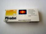
A box of Plivadon pill's
It’s great that Pliva (Plivadon’s maker) makes its product more accessible to blind people. At the same time, this is also a good example of how difficult good accessibility is.

It’s a common misconception that all blind people either know how to read Braille or can learn how to. In fact, a large part if not majority of them don’t and can’t. The reason for this is that you can learn Braille only if tips of your fingers are sensitive enough and that’s usually the case only for those who were born blind or became blind in their youth.

But blindness can be caused by an accident later in life or by various diseases like diabetes, which means it’s far more common among older people, who through years of working with hands lost the necessary sensitivity in their fingers. They are in such cases forced to cope with their usual methods such as being very organized about where they put things.

Pliva (and other companies) could help them more. They could make the shape and size of the box more unique. They could stamp an easily recognizable pattern on parts of the box, just like they did with Braille. Anything that can make the tactile feedback more unique would probably help. 1

Alas they, as more often than not we, don’t do what they easily could.

Notes:

  1. Braille sign on Plivadon’s box is distinguishing enough mark for as long as there isn’t a similarly sized box and a sign at the approximately same position. ↑

rtvslo.si redesign

Slovenian national television has a new design . It’s certainly better than what they had before, but it’s far from perfect.

Fry already described some of the graver errors. But his list is not nearly complete and here are some issues that bother me most:

  • not only is Javascript often inlined, it’s also not degradable (crap like href=”javascript:void really has no place in modern web development)
  • divitis
  • inline CSS
  • ridiculously long list of external resources (87 on main page), which result in excruciatingly long page loads on connections with high latency
  • poor contrast between text and background in large parts of a page can be an accessibility problem

I could go on, but I don’t want to complain too much. As I’ve said before, this page is a clear improvement over the previous one and it’s also obvious from it that their creators do care about modern development and its often forgotten parts like accessibility. This is exactly the reason why I decided to write about its failings and not about some other, more atrocious one. Zavod Embrio shows an ambition for good designs and although I don’t think they’re quite there yet, I’m sure they soon will be.

And I guess my notion that there’s no need for workshops on XHTML, CSS and web standards in general has been proven wrong.

Looking for monitor

I hate buying keyboards or monitors in Slovenia. I hate it almost as much as buying clothes, although looking for decent clothes is usually less futile.

We need to replace a monitor, which developed an affection for pink, so we went out to find a replacement. A 19″ or larger LCD monitor with decent picture would do nicely. Surely a reasonable expectation.

It seems you can get anything you want as long as what you want has a picture that is either misty, has shadow or has a glossy enough screen to see yourself clearly in it even when turned on.

Since nothing was worth buying, we bought nothing. I actually don’t mind that they mostly sell cheap crap, if that is what is selling. But it is hard to imagine that there are so few people looking for decent monitors not to warrant at least one or two decent models on display.